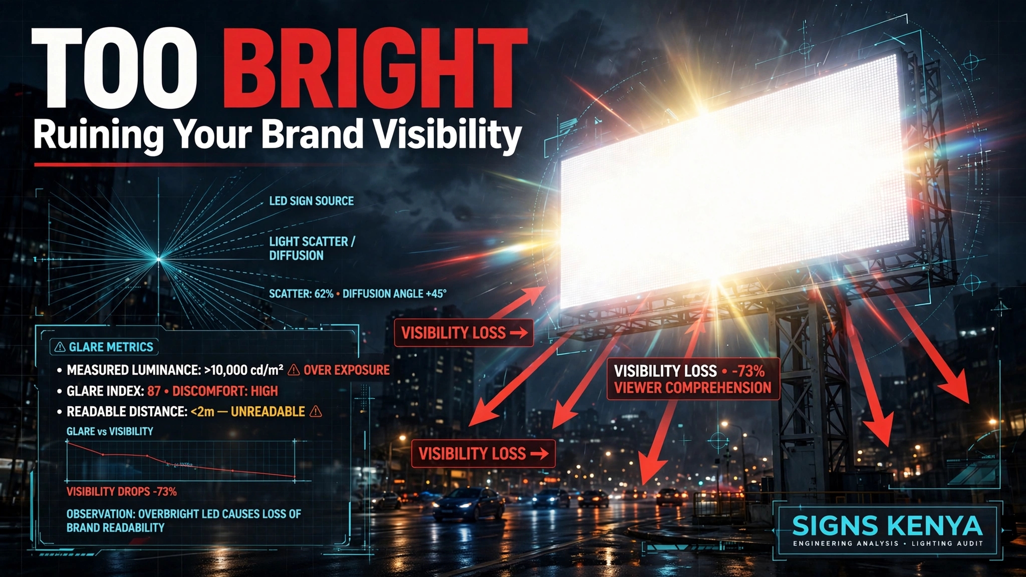
Drive down Waiyaki Way after sunset, and you’ll see a phenomenon that happens hundreds of times a night: an illuminated business sign that is so aggressively bright, it looks like a white-hot glowing rectangle rather than a legible logo.
The owner probably thought they were being clever. They told the sign shop, “Make it as bright as possible—I want people to see me from a mile away.”
They got what they asked for. And it completely backfired.
Because human biology does not care about your advertising budget. When a sign crosses a certain threshold of brightness, the eye doesn’t read the message. It defends itself. And what you end up with is a floodlight that nobody actually looks at.
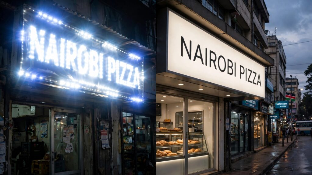
The Common Myth: Brighter Equals Better
This is the single most dangerous assumption in the illuminated signage industry. Business owners equate high lumens with high impact. So they push for more LEDs, higher wattage, and thicker light strips.
Manufacturers who don’t know better happily oblige. It’s cheap to add more lights, and it’s an easy way to make a client feel like they’re getting a “premium” product.
But here is what nobody tells you: A 4,000-nit LED sign is not 20% better than a 3,000-nit sign. In the dark, it is functionally worse.
Why Your Pupils Are the Real Enemy of Readability
Take a moment to think about driving at night. You are cruising along a dark, unlit stretch of road. Your pupils are dilated wide open to catch as much ambient light as possible. Your eyes are adapted to the dark.
Suddenly, you pass a billboard or a storefront sign blasting light at maximum output.
Your eyes do not admire the brightness. They panic.
Your pupillary sphincter snaps shut instantly—the biological equivalent of slamming a door in the face of a blinding intruder. Your pupils shrink from wide-open to pinholes in less than half a second.
What happens next? The surrounding road, the streetlamps, and the dark buildings vanish into even deeper black. Your eyes are now straining to adjust. Meanwhile, that over-bright sign looks like a blurry, overexposed white blob.
No text is legible on a white blob.
The human brain cannot distinguish the edges of a channel letter if the light bleed is too high. Your logo becomes an abstract smear, and the driver looks away to protect their vision. They don’t read your message—they just get annoyed.

The Weber Contrast Rule That Most Fabricators Ignore
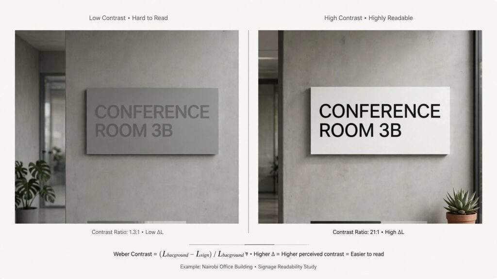
There is a physics principle called Weber’s Law of Contrast. Without getting too technical, it states that the human eye does not perceive absolute brightness. It perceives relative brightness.
The legibility of a sign is completely dependent on the ratio between the sign’s luminance and the immediate ambient background light.
- If the ambient light on a Nairobi street is 50 lux, and your sign shines at 2,000 lux, the contrast ratio is 40:1. That is readable.
- If the ambient light is 50 lux, and your sign shines at 6,000 lux, the contrast ratio explodes to 120:1.
- Theoretically, higher contrast should be better. But in reality, the human retina cannot process that much dynamic range. The sign becomes a visual “overload.” The text bleeds into the background, and the letterforms lose their sharp edges.
We don’t design signs to hit a wattage number. We design signs to hit a luminance target based on where they are going to be installed.
The Halos That Kill Your Logo
Another major failure point is the halo effect—that annoying ring of scattered light that bleeds off the edges of a letter or logo. When cheap white LED strips are jammed inside a polycarbonate face without proper spacing, the light doesn’t exit the sign in a controlled beam. It scatters.
That scatter creates a “glow ring” around every letter. In daylight, you can’t see it. At night, it merges the letters together, turning your beautifully designed 3D channel letters into a single, continuous glowing rectangle.
When the letters merge, the brand disappears. A human eye needs negative space between the edges of letterforms to recognize them. Halos eat that negative space alive.

What We Actually Do (And Why It Costs More)
When we build an illuminated sign, we don’t just buy the brightest LED roll from the local hardware supplier. We specify micro-prismatic diffuser panels—these are specialized acrylic sheets that have thousands of microscopic prisms molded into the surface.
Instead of allowing the light to blast straight through, those prisms bend the light rays at precise angles, spreading the illumination evenly across the face of the letter. The result is a uniform glow that has zero hot spots and virtually zero light bleed at the edges.
We also use a technique called depth-spacing. We don’t mount the LED strips directly against the back of the acrylic. We calculate the exact air gap needed (often between 25mm and 50mm) to guarantee that the light bounces and mixes inside the letter before it hits the front face.
Finally, we map the ambient lighting of the specific location. Is the sign on a brightly lit highway, or a quiet side street? We adjust the driver voltage accordingly. Your sign isn’t just built for maximum brightness—it’s built for maximum clarity in the exact environment where it will live.
The Final Takeaway
A professional illuminated sign doesn’t blow out your retinas. It catches your eye, invites you in, and lets you read the phone number without squinting.
If a sign shop tells you “brighter is better,” they are selling you over-driven LEDs because they don’t know how to design optics. They are treating the signage like a floodlight.
We treat it like a conversation. You don’t yell into a microphone to be heard—you speak clearly. The same principle applies to light. Get the ratios right, control the scatter, and your logo will pull customers in from a hundred meters out.
When you get it right, the driver doesn’t look away. They look twice.